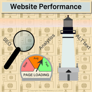
Optimizing Website Performance
Introduction
The performance of your website is crucial because you want a good first impression with your future customers and a reliable experience for your returning customers. A key part of your website’s performance is how quickly it responds to users when they browse through the pages. How quickly your website responds depends on the website hosting provider and the content of your web pages. Assuming you have a reliable, responsive, high-performance web host like OurWebMastery.com, the following are some ways to optimize the content on your website.
Reading Time: 5 minutes
Text
The most critical messages on your website are often in the text you present to your users. Images and videos make your pages more appealing or might generate advertising revenue. Still, pictures and videos can take time to transfer and render nicely. You don’t want your critical messages delayed behind the transfer and scaling of your images and videos.
You can use “lazy loading” of images and videos so your text is presented quickly to users. This is particularly true of adverts; nobody wants to wait for adverts. Some plugins allow you to adjust the lazy loading defaults in WordPress.
Style/Formatting
You should avoid resizing larger images; instead, you can provide multiple versions of images with various resolutions, e.g., 1x, 2x, 4x. A lot of the time to present an image is to transfer the image from your web host to your customer’s computer and then the time to scale the image to fit the resolution required in the final location on the customer’s screen.
Does providing the right resolutions matter? Let’s look at some real test data. Below are the results of our tests of image resizing (scaling) vs. direct rendering.
Image Dimension (px) | Image Size (bytes) | Instance Dimension (px) | Total Displayed Pixels (px) | Web Page Load Time (ms) | Scaling Ratio |
|---|---|---|---|---|---|
1080×1080 | 3,560,762 | 1080×1080 | 1,179,648 | 298 | 1:1 |
1080×1080 | 3,560,762 | 768×768 | 589,824 | 356 | 1.41:1 |
1080×1080 | 3,560,762 | 540×540 | 291,600 | 321 | 2:1 |
540×540 | 918,210 | 540×540 | 291,600 | 199 | 1:1 |
Some findings:
- Firstly, you can see that downscaling a 1080x1080px image to a 768x768px instance is slower (58ms) to load than directly rendering the image at full size. That’s 20% more time, even though what the user sees has half the number of pixels. Scaling by non-integer ratios is particularly slow, 1.41:1 in this case.
- Even a 540x540px instance of that same 1080x1080px image still takes longer (23ms) to load than directly rendering the image at full size. That’s 8% more time, even though it has a quarter of the pixels. Even integer scaling, 2:1 in this case, requires time to throw away 75% of the pixels carefully.
- A correctly sized 540x540px image for that 540x540px instance reduces the load time by 33%, a 99ms time-saving.
Do milliseconds matter? They do because they add up if you have many images on your pages. Humans start to perceive differences in delays once they exceed 50-100ms. Your page load can seem slow if users perceive that everything is not visible simultaneously.
Do shifts slow down your web pages? You should avoid shifts. When a browser creates the page view that users see, it has to reserve space for items like images and videos that it might not yet have on hand. If you provide width and height dimensions for images and videos, the browser can reserve space in the page view and add them later. If you don’t give this information, the browser might make a wrong assumption about the space to reserve. Then, once the media arrives, it has to shift the layout to make space. Users will see this shift as a stutter in the page presentation, which is highly undesirable.
Images
AVIF and WebP are image formats with superior compression and quality characteristics compared to their older JPEG and PNG counterparts. Encoding your images in these formats rather than JPEG or PNG means your pages load faster on all devices and consume less cellular data when viewed on mobile devices.
WebP (WebPicture) is supported in the latest versions of Chrome, Firefox, Safari, Edge, and Opera and provides better lossy and lossless compression for images on the web.
Google actively promotes WebP, and both PageSpeed and Lighthouse website performance assessment tools recommend switching from JPEG and PNG to WebP. However, the benefit is more significant if you have larger images.
When does using superior compression matter? Let’s look at some real test results. Below are the results of testing page load times vs image size comparing images in PNG vs. WebP formats.
Image Dimension (px) | PNG Image Size (bytes) | WebP Image Size (bytes) | PNG Load Time (ms) | WebP Load Time (ms) | Load Time Saving (ms) | Load Time Saving (%) |
|---|---|---|---|---|---|---|
1080x1080px | 3,560,762 | 1,566,436 | 298 | 226 | 72 | 24.2 |
540x540px | 918,210 | 490,042 | 199 | 181 | 18 | 9.1 |
270x270px | 233,561 | 129,894 | 138 | 133 | 5 | 3.6 |
Some findings:
- The load times for small images (270x270px) are less than 5% different between PNG and WebP compression formats.
- The load time of larger images (1080x1080px) is 25% faster with WebP than PNG.
- The improvement in load times between WebP and PNG is in line with the ratio of the number of pixels in the images, e.g., a 1080x1080px image improves by 72ms vs. a 540x540px image improves by 18ms. The improvement aligns with the 4x number of pixels between the image resolutions.
What can you do about this? Use a superior compression format for your larger images. Avoid using higher-resolution images than needed for your target devices. Offer multiple resolutions so browsers can pick the best images for the user’s device window/viewport size.
Videos
Videos present multiple hits on website performance.
- Video files are large and quickly eat into your website storage budget.
- Video files are streamed and can quickly eat into your website server bandwidth budget.
- Video files come in multiple formats and resolutions. They may need transcoding to support the format preferred by the target browser or display device.
The bottom line in providing video? Do not upload your videos to your website; instead, upload them to a third-party site like YouTube and embed them in your website as links.
What if you absolutely must have videos uploaded to your website? While not advisable, here are some tips to pay attention to:
- Provide multiple file formats and resolutions to allow browsers to choose a format they support and optimize for the user’s device window/viewport size. There are tools to transcode video files offline into various formats and resolutions.
- The native HTML attribute, preload=”none”, can be added to video tags.
- Use a plugin to enable the lazy loading of videos.
WordPress Specific
WordPress has lazy loading enabled by default for images and iframes since version 5.5. By default, WordPress will add the native HTML attribute loading=”lazy” to all img tags that have width and height attributes present.
Summary
A website with pleasing text, images, and video mix can engage your current and future customers. Keeping a website quick to load and responsive to the many different viewing devices can be daunting. There are things you can do to make the images and videos on your website available in multiple formats and resolutions to give browsers the best chance of presenting your web pages quickly and responsively. Videos are complicated to get right; You should let content delivery experts like YouTube handle them and embed them as links on your website.
References
- Web: https://en.wikipedia.org/wiki/WebP
- Web: https://developer.wordpress.org/apis/responsive-images/
- Web: https://make.wordpress.org/core/2020/07/14/lazy-loading-images-in-5-5/
- Web: https://imagekit.io/blog/lazy-loading-html-videos/
Further Reading
See our article “Website Performance – Good practices for WordPress site owners” for more details on reducing the risk of attacks on your website.
See our article “Malware – Good practices for WordPress site owners” for more details on reducing the risk of attacks on your website.
See our article “Backups – Good practices for WordPress site owners” for more details.